
# 伪元素
常用
select::after{
}
select::before{
}
搭配content
attr自定义属性 设置在元素上data-xxx='???'
content:attr(data-xxx) attr自动匹配元素相应的自定义属性值
url('xxxxxxx')
# 设置伪元素 hover
select::after:hover {
  opacity: 1;
  color: red;
  ...;
}
# 伪元素绑定事件
需要父元素设置css属性
pointer-events: none;
此时父元素不再生效所有事件,hover也是
select::after{
  point-events:auto;
}
# 案例
# hover 图片
<div class="adv">
  <div
    class="left"
    data-left="left is in your left hand"
    data-right="right is your right hand"
  ></div>
  <div class="right" data-left="新三年旧三年" data-right="缝缝补补又三年"></div>
</div>
.adv {
  width: 1000px;
  height: 300px;
  border: 1px solid #000;
  display: flex;
  justify-content: space-between;
}
.left,
.right {
  position: relative;
  border: 1px solid #000;
  width: 100%;
  height: 100%;
}
.right {
  overflow: hidden;
  background-color: aquamarine;
}
.left {
  background-color: blanchedalmond;
}
.left::before,
.left::after {
  z-index: 1;
  width: 100%;
  height: 50%;
  position: absolute;
  opacity: 0;
  transition: all 0.5s;
  color: #ff8746;
  text-align: center;
  font-size: 30px;
  line-height: 100%;
}
.left::before {
  content: attr(data-left);
  left: 0;
  background-color: royalblue;
}
.left::after {
  content: attr(data-right);
  bottom: 0;
  background-color: crimson;
}
.left:hover::after,
.left:hover::before {
  opacity: 1;
}
.right::before,
.right::after {
  z-index: 1;
  width: 100%;
  height: 50%;
  position: absolute;
  transition: all 0.3s ease-in-out;
  color: #ff8746;
  text-align: center;
  font-size: 30px;
  line-height: 100%;
}
.right::before {
  content: attr(data-left);
  transform: translateY(-100%);
  background-color: royalblue;
}
.right::after {
  content: attr(data-right);
  bottom: 0;
  background-color: crimson;
  transform: translateY(100%);
}
.right:hover::after,
.right:hover::before {
  transform: translateY(0);
}
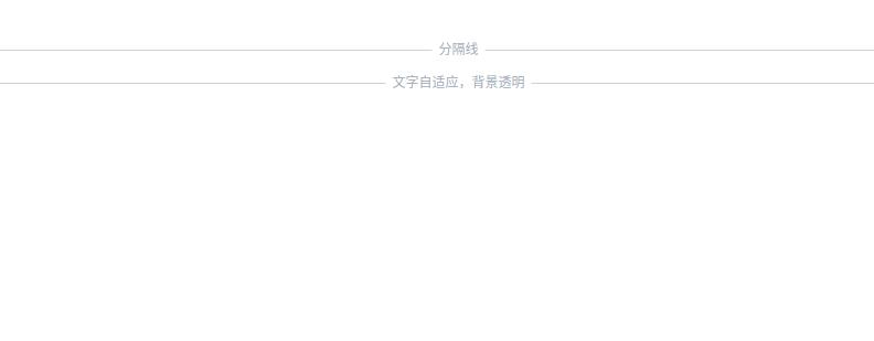
# 分割线
<hr class="hr-solid-content" data-content="分隔线" />
<hr class="hr-solid-content" data-content="文字自适应,背景透明" />
.hr-solid-content {
  color: #a2a9b6;
  border: 0;
  font-size: 12px;
  padding: 1em 0;
  position: relative;
}
.hr-solid-content::before {
  content: attr(data-content);
  position: absolute;
  padding: 0 1ch;
  line-height: 1px;
  border: solid #d0d0d5;
  border-width: 0 99vw;
  width: fit-content;
  /* for IE浏览器 */
  white-space: nowrap;
  left: 50%;
  transform: translateX(-50%);
}
效果图如下